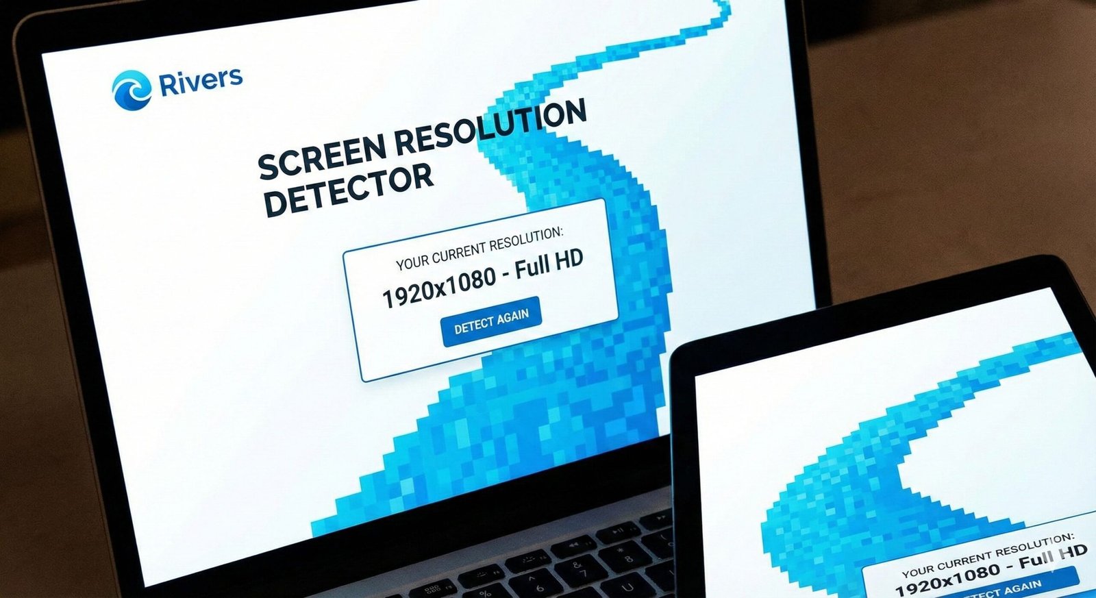
Screen Resolution Detector
This tool detects and displays your current screen resolution, device pixel ratio, and other display information. It helps web developers, designers, and anyone who needs to know their screen specifications.
How to use: Simply view this page and your screen resolution information will be displayed automatically. Click “Refresh Info” if you change your display settings or rotate your device.
Screen Resolution Detector – Check Your Display Now
Instantly detect your screen resolution, viewport size, and color depth. Our free tool helps web developers and designers optimize sites for any device.
Screen Resolution Detector: Unlock Your Display’s True Potential and Optimize User Experience
Have you ever visited a website that looked perfect on your phone but broken on your desktop, or wondered why a high-resolution image appears blurry on your specific monitor? The culprit is often a mismatch between the website’s design and your screen’s capabilities. Manually guessing your display properties is ineffective and leads to a poor digital experience.
This is where a Screen Resolution Detector becomes an essential tool for developers, designers, and even everyday users. A Screen Resolution Detector is an online utility that instantly analyzes and reports your display’s key properties, including its resolution, color depth, and viewport size. By using a Screen Resolution Detector, you can ensure your projects are visually perfect on every device, troubleshoot display issues, and make informed decisions about your own hardware.
What is a Screen Resolution Detector and How Does It Work?
A Screen Resolution Detector is a web-based tool that uses JavaScript and other client-side technologies to query your web browser for information about the device’s display. The browser, in turn, communicates with the operating system to gather this data.
The tool is completely passive and secure. It doesn’t install any software or access your personal files. It simply asks the browser, “What are the specifications of the screen you’re being displayed on?” and then presents that information to you in a clear, easy-to-understand format.
Using our Screen Resolution Detector tool provides instant, accurate insights that are crucial for creating a seamless digital experience. It turns abstract technical specs into actionable data.
Why Knowing Your Screen Resolution is Critical in a Multi-Device World
We interact with content across a vast ecosystem of devices, from large desktop monitors to compact smartphones. Understanding resolution is key to navigating this landscape effectively.
For Web Developers and Designers: Crafting Pixel-Perfect Experiences
A developer needs to know the canvas they are painting on. Using a Screen Resolution Detector is the first step in responsive web design.
- Media Query Validation: It helps you test and confirm that your CSS media queries are triggering at the correct breakpoints.
- Cross-Browser Testing: Ensures your layout renders consistently across different browsers and devices by giving you precise viewport dimensions.
- Image Optimization: Allows you to serve appropriately sized images, reducing page load times and saving bandwidth for users on smaller screens.
For Gamers and Enthusiasts: Validating Display Settings
Gamers invest in high-refresh-rate monitors for a competitive edge. A detector can confirm that your game and operating system are actually running at the monitor’s native resolution and advertised refresh rate, ensuring you’re getting the performance you paid for.
For Remote Workers and IT Support: Troubleshooting Display Issues
When a colleague complains that “everything looks too big” or a client can’t see a full webpage, the issue is often an incorrect resolution setting. A quick link to the detector can instantly diagnose the problem, guiding them to adjust their display settings.
Key Metrics Revealed by a Screen Resolution Detector
A powerful detector goes beyond just telling you the number of pixels. It provides a comprehensive overview of your display environment.
Screen Resolution Detector
This is the total number of distinct pixels in each dimension that can be displayed (e.g., 1920×1080). It represents the entire physical display area.
2. Browser Viewport Size
This is the currently visible area inside your browser window, excluding toolbars, scrollbars, and the address bar. This is arguably more important than screen resolution for web design, as it’s the actual space your website has to work with.
3. Color Depth
Measured in bits per pixel (bpp), this defines how many unique colors your screen can display. A standard modern display is 24-bit or 32-bit, capable of showing over 16 million colors.
4. Pixel Ratio
This reveals the device’s pixel density. A ratio of 1 is standard. A ratio of 2 or 3 (common on “Retina” or high-DPI displays) means there are multiple physical pixels for every logical CSS pixel, resulting in sharper images and text.
Just as a Screen Resolution Detector optimizes your view of a website, ensuring your images are the right size optimizes the website itself. For that, use our Image Resizer tool.
How to Use Our Screen Resolution Detection Tool
Our tool is the epitome of simplicity. It’s designed to deliver critical information with zero effort from the user.
- Navigate to the Tool: Simply visit the Screen Resolution Detector page.
- Allow the Page to Load: The tool runs automatically. No buttons to click.
- View Your Results: Instantly, you will see a dashboard displaying all your key screen and viewport metrics.
The entire process takes less than three seconds and provides a wealth of technical data about your current browsing session.
Understanding the Results: A Detailed Breakdown
Let’s decipher what the numbers mean when you use the detector.
Example Output:
- Screen Resolution: 2560 x 1440 pixels
- Available Screen Size: 2560 x 1440 pixels
- Browser Viewport Size: 2536 x 1325 pixels
- Color Depth: 24 bit
- Pixel Ratio: 1
Analysis:
- The user has a WQHD (1440p) monitor.
- The “Available Screen Size” is the same, meaning the browser is in full-screen mode.
- The viewport is slightly smaller due to the space taken up by the browser’s own UI (scrollbar, etc.).
- The color depth is excellent for photo editing and gaming.
- The pixel ratio of 1 indicates a standard density display.
The Critical Difference: Screen Resolution vs. Browser Viewport
This is the most important concept for web professionals to grasp.
- Screen Resolution: The total size of your physical monitor. It is a fixed property of the hardware.
- Browser Viewport: The available area within the browser window where a webpage is displayed. It is dynamic and changes when you resize the browser window.
A user with a 1920×1080 screen might have their browser windowed at 1200×800. Your website needs to adapt to the 1200×800 viewport, not the 1920×1080 screen. Our detector clearly shows both, preventing this common design pitfall.
Real-World Applications and Use Cases
For a Web Developer: Debugging a Layout Issue
A client reports that the navigation menu breaks on their laptop. You ask them to run the detector. They report a viewport width of 1024px. You instantly know your CSS media query for tablet layouts (set at 768px) is incorrectly designed and not accounting for this in-between size. You fix the media query, solving the problem.
For a Digital Marketer: Analyzing Audience Data
Using resolution data from analytics tools, a marketer can see that a significant portion of their audience uses 1366×768 screens. This informs design decisions, ensuring that key calls-to-action and forms are always visible without scrolling on those specific devices.
For a Graphic Designer: Preparing Assets
A designer creating a website hero image can use the detector on their target devices to understand the maximum viewport height and width they need to design for, ensuring the image crops beautifully on all screens.
The Evolution of Screen Resolutions: What the Data Shows
Screen resolution trends directly influence web design standards. According to long-term data from StatCounter, the dominance of 1920×1080 has been consistent for years, but mobile resolutions and larger desktop formats are steadily gaining share.
This data underscores why a “one-size-fits-all” approach to web design is obsolete. The most popular resolution is often “Many.” Responsive design, tested with tools like our detector, is the only viable strategy.
Frequently Asked Questions (FAQ)
Is this tool safe to use? Does it collect my data?
Why does my browser viewport size not match my screen resolution?
The tool shows a ‘Pixel Ratio’ of 2. What does that mean?
Conclusion: See Your Screen in a Whole New Light
Your display is the window to the digital world, and understanding its capabilities is the first step toward a better experience, whether you’re building websites or simply consuming content. A Screen Resolution Detector demystifies your hardware, providing the concrete data needed for optimization, troubleshooting, and informed decision-making.
Stop guessing about your display. Gain the clarity you need to create, work, and play more effectively. Ready to see the full picture? Use our free, instant Screen Resolution Detector tool now and unlock the precise specifications of your screen in seconds!
Use this when you first explain what screen resolhttps://vesa.orgution is.