Color Contrast Checker
Compute contrast ratio and WCAG pass/fail for normal and large text.
Color Contrast Checker: Test ADA & WCAG Compliance
Ensure your design is accessible! Our free Color Contrast Checker tests color combinations for WCAG compliance. Perfect for websites, apps, and documents.
Color Contrast Checker: Ensure Your Designs Are Accessible to Everyone
Have you ever visited a website where the text was barely readable against the background? Or struggled to distinguish buttons because they blended into the page? This common design flaw doesn’t just create a poor user experience—it can exclude millions of people with visual impairments from accessing your content.
A Color Contrast Checker is an essential tool for designers, developers, and content creators that solves this critical problem. This specialized utility analyzes the contrast ratio between two colors (typically foreground and background) to ensure text is legible and meets established accessibility standards. By using this tool, you can create inclusive digital experiences that are usable by people with color blindness, low vision, and other visual impairments, while also improving readability for all users.
What is a Color Contrast Checker and How Does It Work?
A Color Contrast Checker is a digital tool that calculates the luminosity contrast ratio between two colors. This ratio measures the difference in light between the foreground color (usually text) and the background color. The calculation follows a specific mathematical formula defined by the Web Content Accessibility Guidelines (WCAG).
The tool operates through a precise technical process:
- Color Input: You provide two color values, typically via hex codes, RGB values, or color pickers.
- Luminosity Calculation: The tool calculates the relative luminance of each color. This is a measure of the perceived brightness, weighted to account for human vision (we see green as brighter than blue, for example).
- Contrast Ratio Calculation: Using the luminance values, it applies the WCAG formula:
(L1 + 0.05) / (L2 + 0.05)where L1 is the luminance of the lighter color and L2 is the luminance of the darker color. - Result Interpretation: The tool displays the contrast ratio and evaluates it against WCAG success criteria.
Using our Color Contrast Checker automates this complex process, providing instant, actionable feedback on your color choices.
Why Color Contrast Checker Matters: Beyond Aesthetics
Proper color contrast is not merely a design preference—it’s a fundamental requirement for accessibility, usability, and legal compliance.
Digital Accessibility and Inclusion
Approximately 300 million people worldwide have color vision deficiency (color blindness). Additionally, many users with low vision, cataracts, or age-related vision decline rely on sufficient color contrast to read digital content. By ensuring high contrast, you make your website, app, or document accessible to this significant portion of the population.
WCAG Compliance and Legal Requirements
The Web Content Accessibility Guidelines (WCAG) are the internationally recognized standard for digital accessibility. Many countries, including the United States with its Americans with Disabilities Act (ADA), have laws requiring digital accessibility for public-facing websites. Non-compliance can lead to legal action and costly lawsuits.
Enhanced User Experience for Everyone
Good contrast benefits all users, not just those with visual impairments. It improves readability in bright sunlight, on older displays, and in suboptimal lighting conditions. Clear contrast reduces eye strain and makes content easier to scan and comprehend quickly.
Business Impact and SEO
Accessible websites often have better usability metrics, including lower bounce rates and higher conversion rates. While not a direct ranking factor, the Google Webmaster Guidelines emphasize creating a good user experience, which includes accessibility features like proper color contrast.
Understanding WCAG Standards: The Benchmark for Accessibility
The Web Content Accessibility Guidelines outline specific success criteria for color contrast. Understanding these levels is crucial for using a Color Contrast Checker effectively.
WCAG Level AA (Minimum Requirement)
This is the standard most organizations aim to meet for general accessibility compliance.
- Normal Text: Contrast ratio of at least 4.5:1 for text smaller than 24px (or 19px if bold).
- Large Text: Contrast ratio of at least 3:1 for text 24px or larger (or 19px if bold).
- User Interface Components: Visual information required to identify UI components and states must have a 3:1 contrast ratio.
WCAG Level AAA (Enhanced Requirement)
This represents a higher standard of accessibility.
- Normal Text: Contrast ratio of at least 7:1 for text smaller than 24px (or 19px if bold).
- Large Text: Contrast ratio of at least 4.5:1 for text 24px or larger (or 19px if bold).
Exceptions
Logos, incidental text, and purely decorative elements are exempt from these requirements. However, all functional text should meet the appropriate contrast ratios.
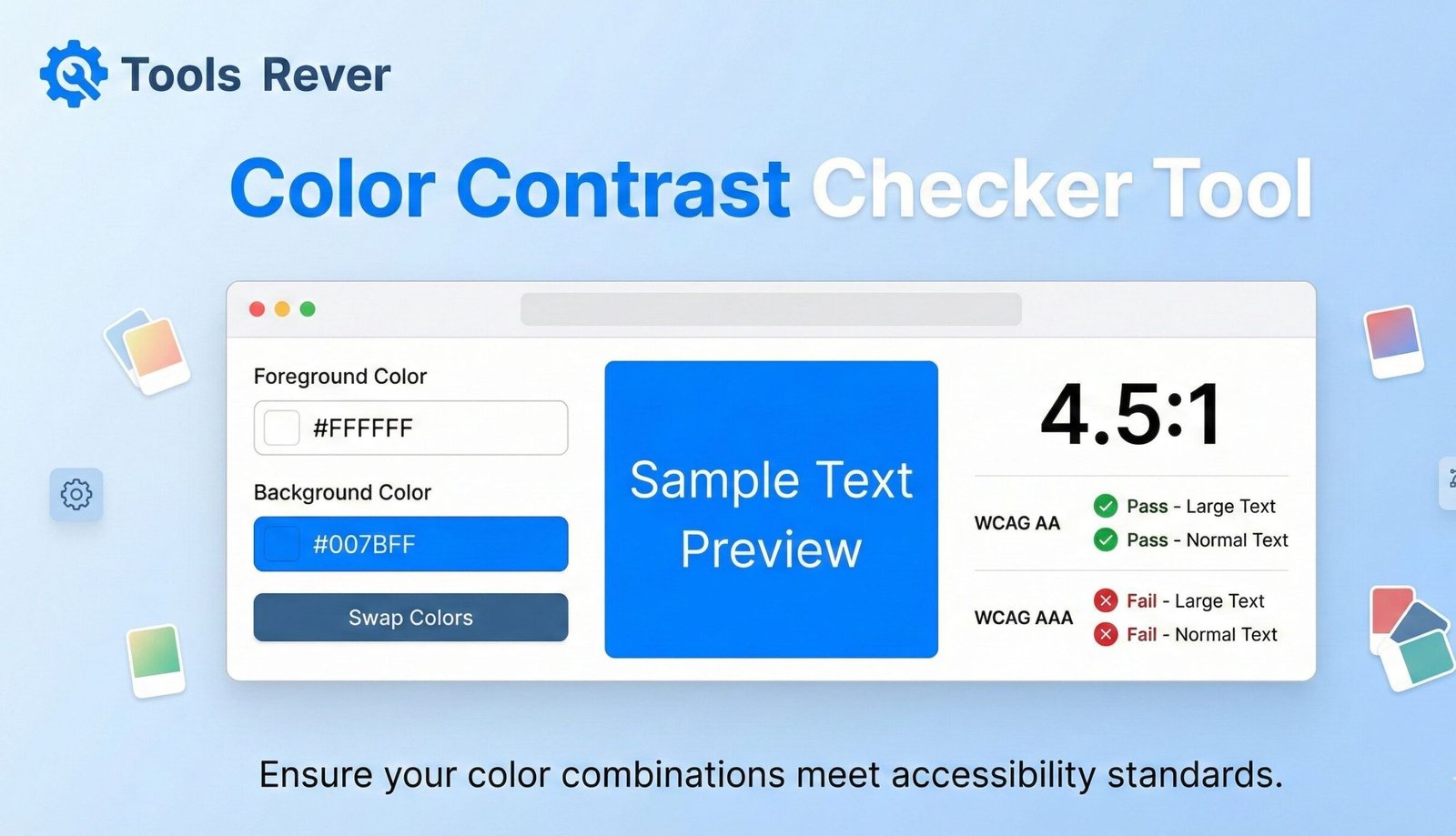
How to Use Our Color Contrast Checker: A Step-by-Step Guide
Our tool is designed for simplicity and efficiency. You can test any color combination in under 30 seconds.
Step 1: Access the Tool
Navigate to our Color Contrast Checker.
Step 2: Input Your Colors
Enter your foreground (text) and background colors. You can do this by:
- Typing hex codes (e.g., #FFFFFF for white)
- Using RGB sliders
- Using the visual color picker
Step 3: Review Automatic Results
The tool will instantly calculate and display:
- The contrast ratio (e.g., 4.5:1)
- A pass/fail indicator for WCAG AA and AAA levels
- A visual preview of how the colors look together
Step 4: Analyze and Adjust
If your combination fails, use the tool to adjust colors until you achieve compliance. The real-time feedback makes this an iterative and educational process.
Example Test:
- Foreground: #777777 (medium gray)
- Background: #FFFFFF (white)
- Result: Contrast Ratio 4.5:1 – PASSES WCAG AA for normal text
Common Color Contrast Pitfalls and How to Avoid Them
Even experienced designers can fall into these common traps that create accessibility barriers.
Low Contrast on Calls-to-Action
Buttons with insufficient contrast against their background can dramatically reduce conversion rates. Users may not see or understand what action to take.
Placeholder Text as Labels
Light gray placeholder text in form fields often fails contrast requirements. Once a user starts typing, the label disappears, causing confusion.
Text Over Background Images
Images with varying light and dark areas make consistent text contrast impossible. Use solid color overlays or position text consistently over a single-toned part of the image.
Disabled Button States
“Grayed out” buttons often have very low contrast. While they indicate inactivity, they should still be legible to all users.
Error States and Form Validation
Error messages in light red may not have sufficient contrast to be noticeable. Similarly, success messages in light green can be missed.
Just as a Color Contrast Checker ensures your text is readable, our Image Resizer tool ensures your visual content is properly sized for all devices.
Color Contrast and Different Types of Color Blindness
Understanding how color deficiencies affect perception helps create more accessible designs.
Deuteranopia (Green-Weak)
The most common form, affecting about 6% of males. Reds and greens appear similar, and colors generally look muted.
Protanopia (Red-Weak)
Affects about 2% of males. Difficulty distinguishing between blue and green, and between red and green.
Tritanopia (Blue-Weak)
A rarer form affecting both sexes equally. Difficulty telling blue from green and yellow from violet.
A Color Contrast Checker helps overcome these issues by ensuring legibility doesn’t rely on color alone. The luminosity contrast remains effective regardless of how colors are perceived.
Advanced Features of a Comprehensive Color Contrast Checker
Beyond basic ratio calculation, robust tools offer additional functionality.
Multiple Text Size Previews
Display how your colors look at different font sizes and weights (normal, large, bold).
Color Blindness Simulator
Show how your color combination appears to users with different types of color vision deficiency.
Suggested Color Adjustments
When a combination fails, the tool can suggest nearby colors that would pass contrast requirements.
Compliance Reporting
Generate reports documenting your color choices and their compliance status for client presentations or audit trails.
Real-World Applications: Who Needs This Tool?
Web Designers and Developers
Ensure all text on websites and web applications meets accessibility standards before deployment.
UX/UI Designers
Create accessible design systems and component libraries with predefined color combinations that pass contrast checks.
Content Creators and Marketers
Verify that text in social media graphics, infographics, and PDF documents is readable by all audiences.
Product Designers
Check contrast in mobile apps, software interfaces, and digital products.
Educators and Institutions
Ensure learning materials and online course content are accessible to students with visual impairments.
Frequently Asked Questions (FAQs)
What is the minimum acceptable contrast ratio for normal text?
Can I use color alone to convey information?
Do these guidelines apply to logos and decorative elements?
Conclusion: Build a More Inclusive Digital World
Color contrast is not just a technical requirement—it’s a fundamental aspect of inclusive design that ensures your content can be accessed and understood by the broadest possible audience. A Color Contrast Checker empowers you to create digital experiences that are not only beautiful but also functional, compliant, and welcoming to users of all abilities. By integrating this tool into your design and development workflow, you demonstrate a commitment to accessibility that benefits both your users and your organization.
Stop guessing about color accessibility and start testing with precision. Ready to ensure your designs are accessible to everyone? Use our free, instant Color Contrast Checker tool now to test your color combinations against WCAG standards and build more inclusive digital experiences!